UBS - Smart
Objective:
To review the current design and usability of the Smart application web interface used today
Identify areas of improvement
Look at how the system could be improved when redesigned using the NEO Web SDK application
Improve the overall usability and experince.
The Process
- Review of current application
- Mapping our current pages within the system with notes
- Sit down with various end business users to understand the day-to-day tasks and processes they go through
- Identify current pain points within the system
- Map out old and potential new user journeys
- Map out pain points on current screens
- Review of NEO Web SDK library and how the system could look
- Product draft screens of how the system could look
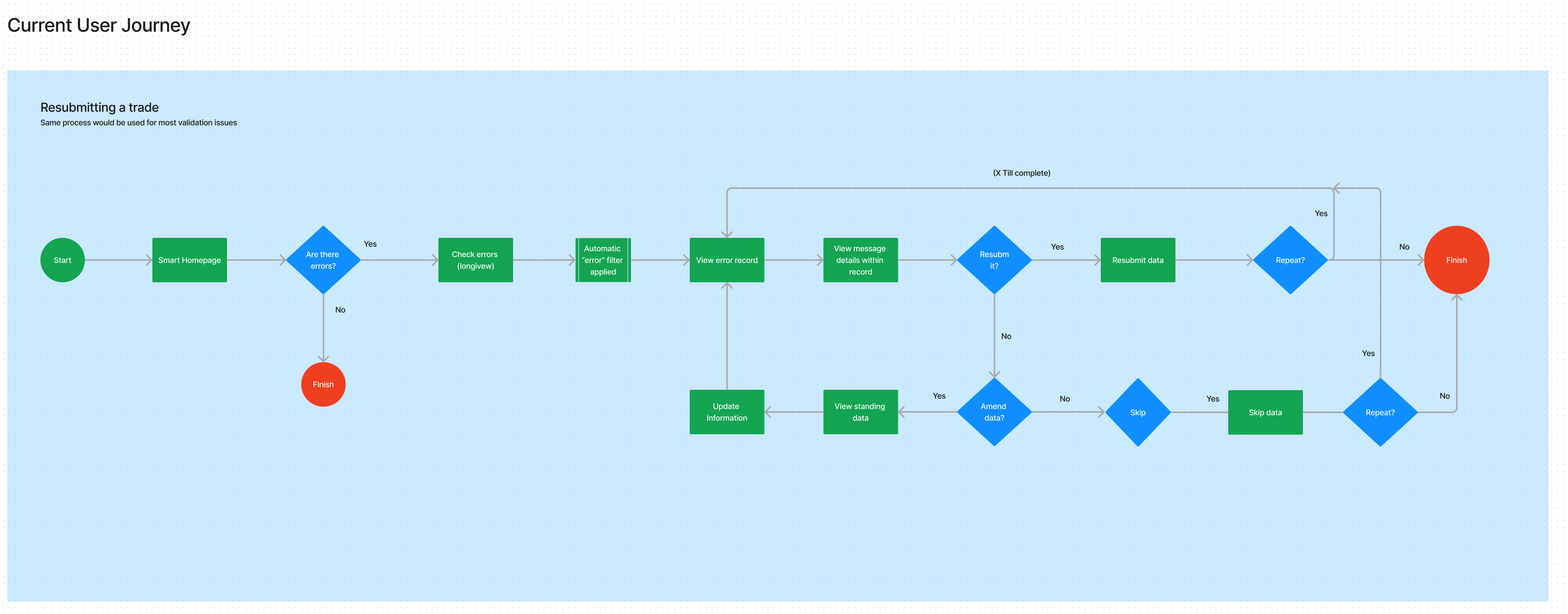
Mapping out the current User Flows
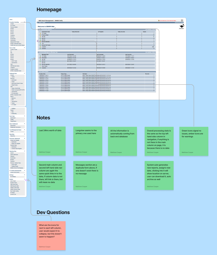
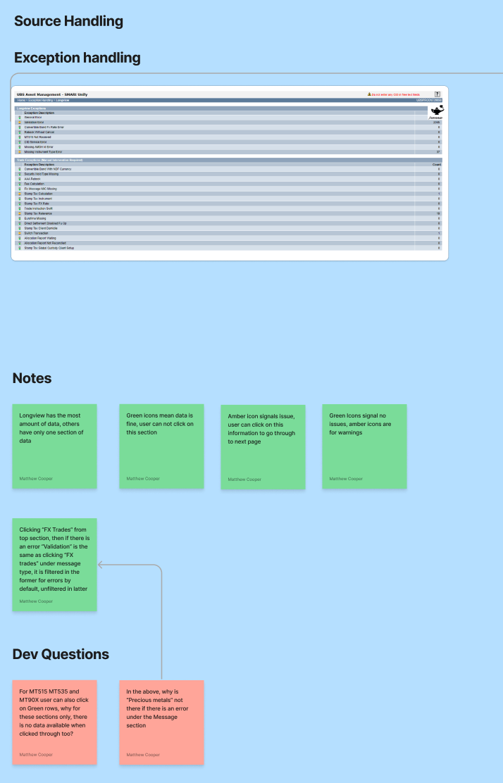
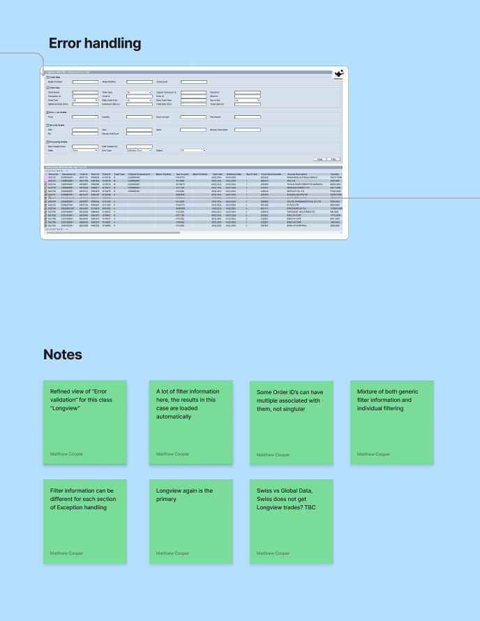
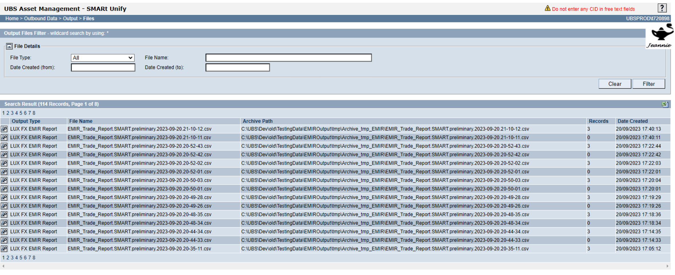
Time was spent going through the current platform, and identifying the core pages and processes performed with them
Below is a slider gallery where you can see some of these pages with dummy data
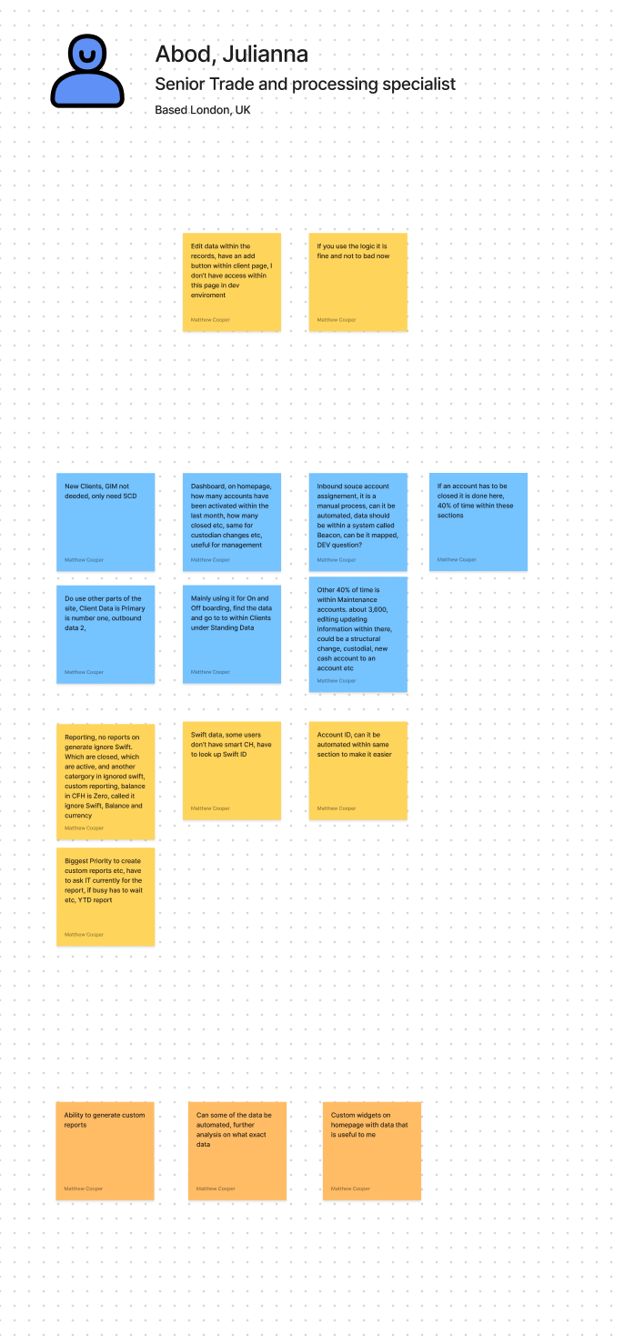
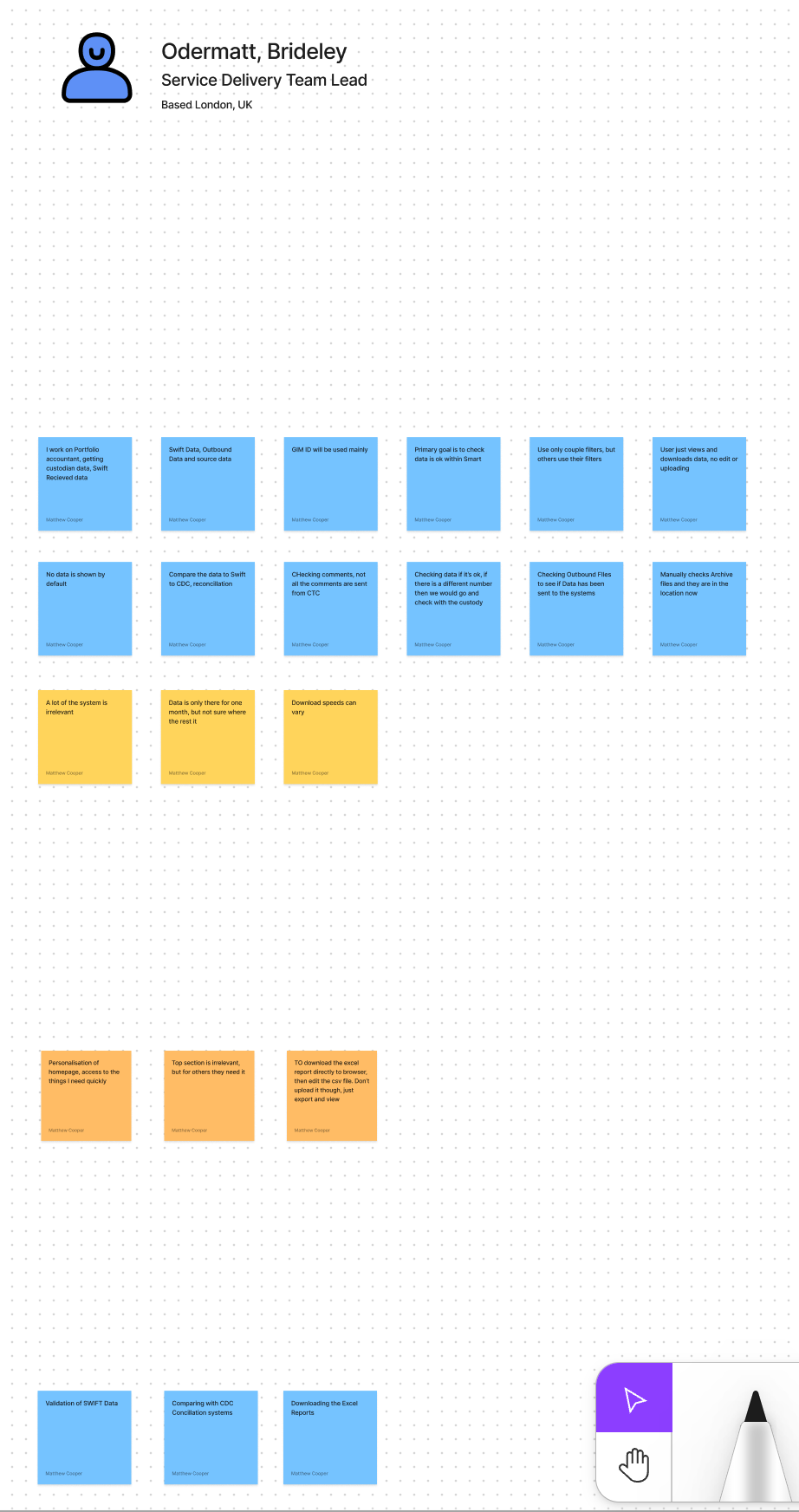
Interviews with the current users of the platform
In order to understand the current issues within the platform, it was important to get feedback from some of people who use it day in day out, the following feedback sessions were conducted with users.
Image slider below with the feedback sessions and notes conducte
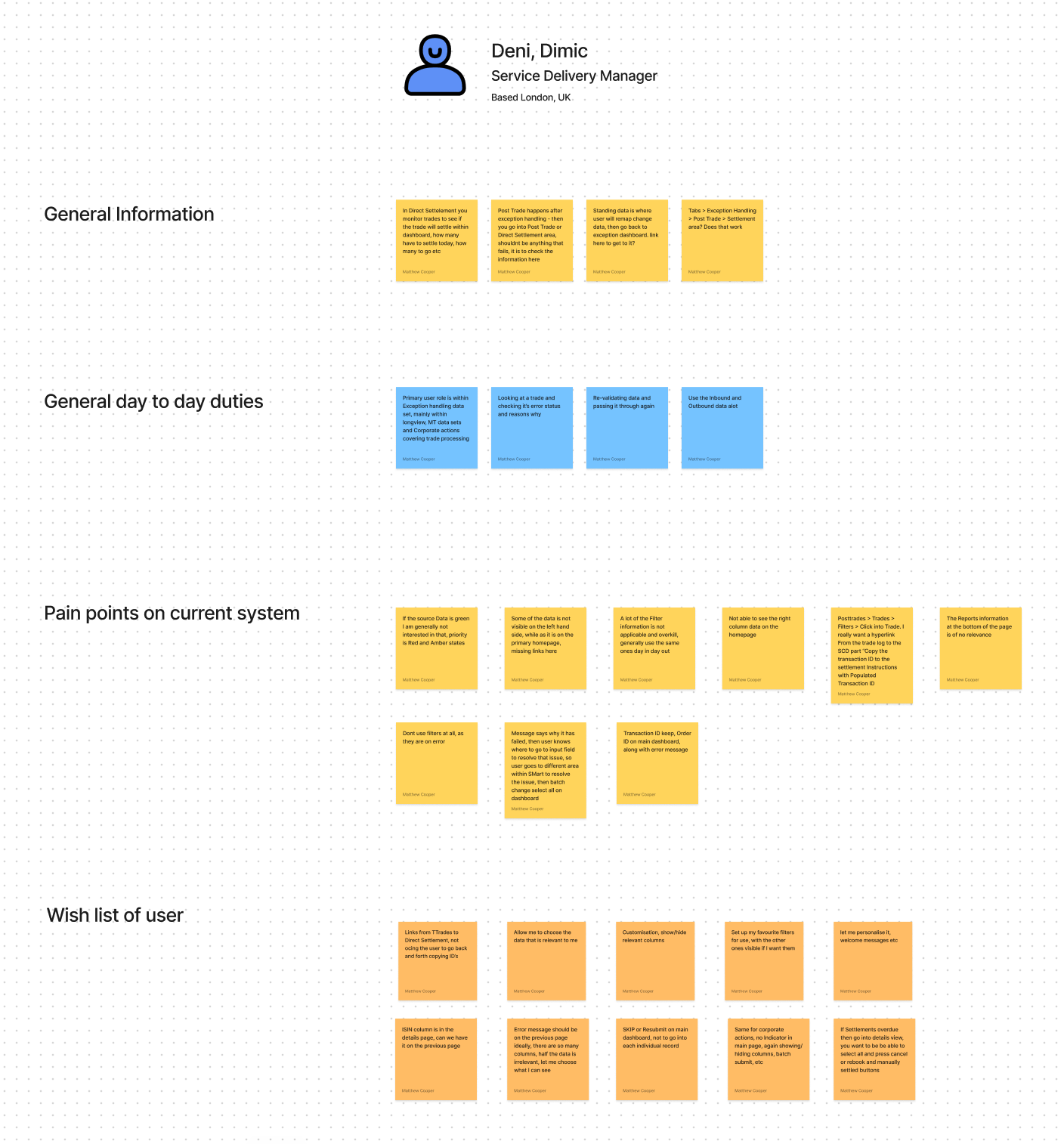
Key Themes from the feedback sessions
Too much repetition performing processes (I.e.Resubmit, Remove all etc)
Some data missing from Datasets and left hand side navigation
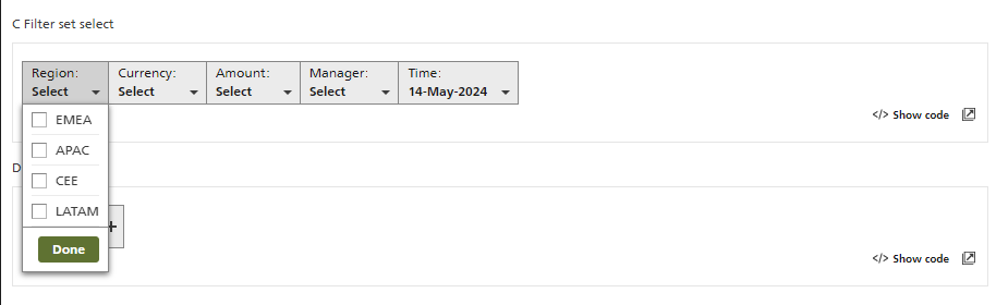
Too much filter information (most users only used 2-5 filters)
Too much search result data/column data
Not enough link up between data sets (I.e. jumping from pages with having pre filled data in place, this is all data that exists within the system
Reporting/export data is a very manual process
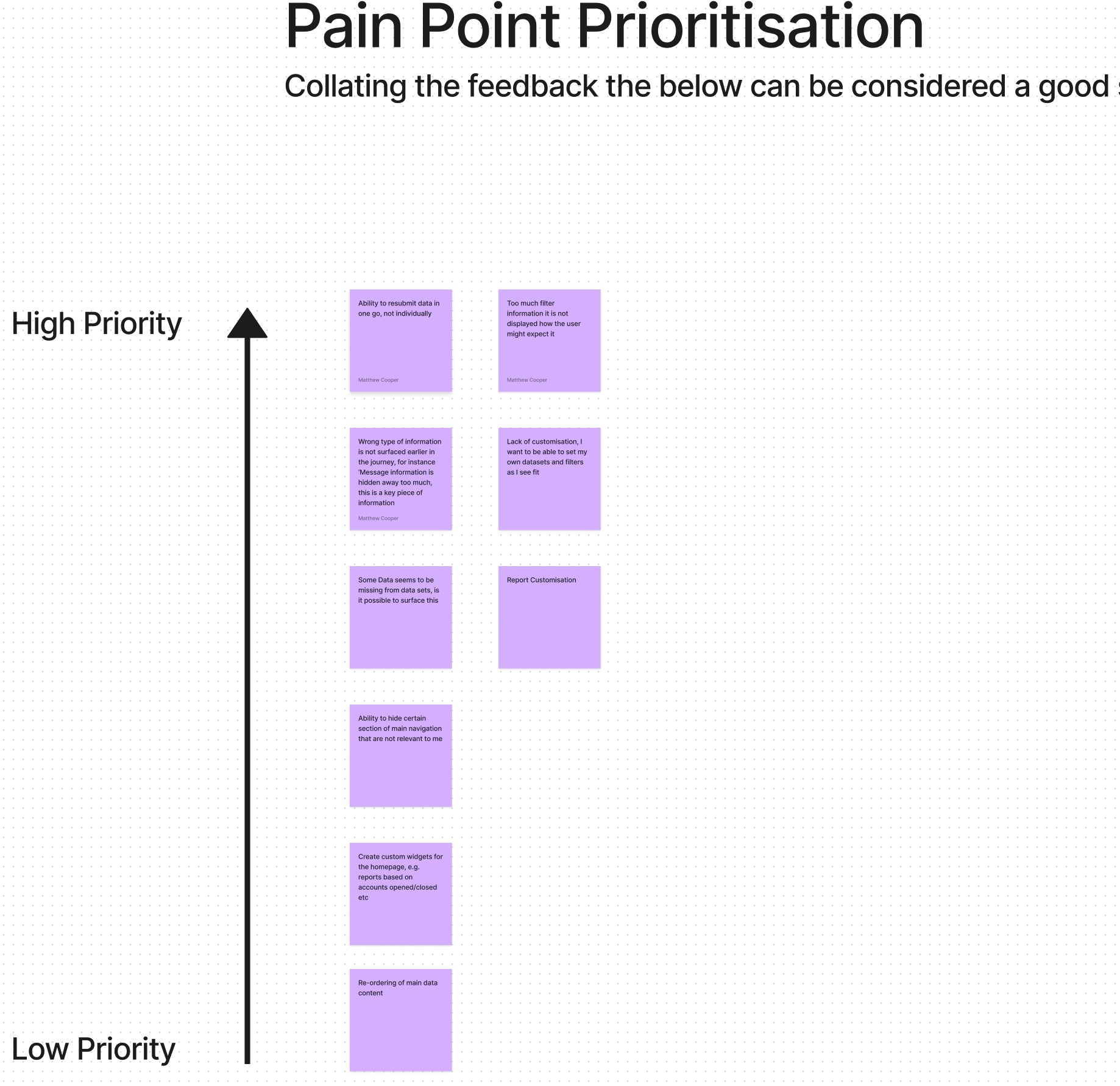
Pain point Prioritisation
With the feedback collated there were some key themes that could definitely be researched and improved on.
Mapping some of the kew user journeys
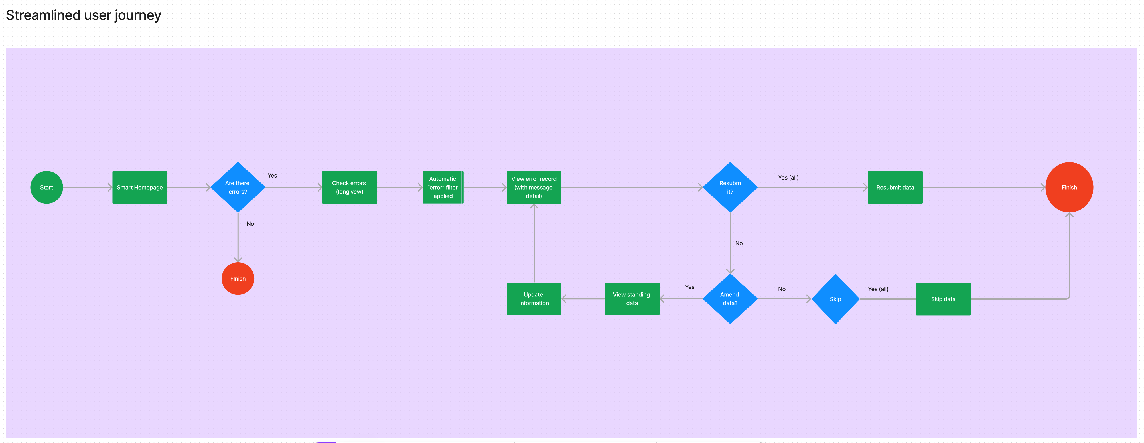
Mapping the current issues to the individual pages
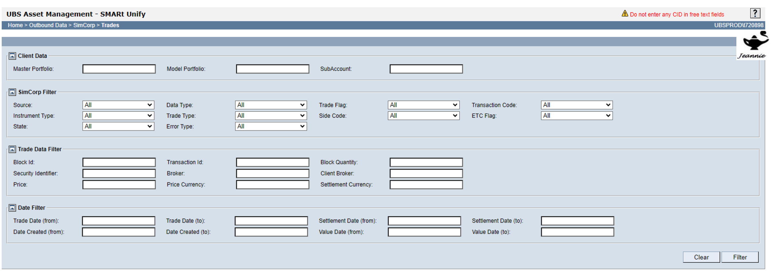
Too much filter information, most of which is not used
No correlation between data fields and Filters, some seems to be missing
Inconsistencies between data returned by default, and other data which requires user to click “filter”
• No ability to batch select records and “Resubmit” or “Remove all”
Data returned is not necessarily useful to the user at this point
No ability to customize/re-order data which is useful to user
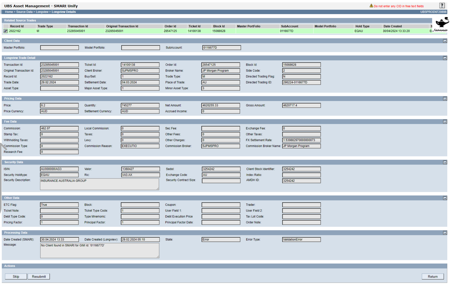
Message information shown here should be surfaced earlier in the journey
Hierarchy of data could be better/condensed with ability to show/hide
Forcing user to perform same task here, as opposed to earlier in the journey, very slow repetitive process currently
Exploring the new Design Language
Based on the above research and feedback, next steps were to start going through the Web SDK Framework, and to identify potential solutions which could improve the user experience., the following things can be identified
Navigation options.
Top vs Side menu hierarchy structure, the current information on Smart is listed using a left hand side tree, there is also the ability to show/hide depending on your role. Based on this it might be preferable to stick with a left hand structure, as the top menu might not accommodate all options, further investigation into a card sorting exercise, and if the current framework can support a show/hide interface to streamline the options available to the user. Other things identified were
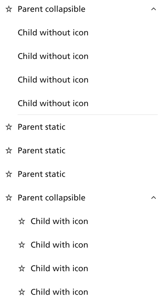
- Segment control to show/hide relevant options
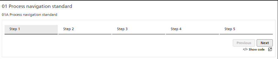
- Process Navigation for any potential long tasks
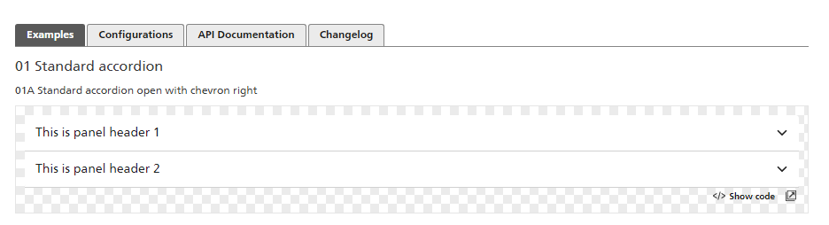
- Accorion control to reduce information overload
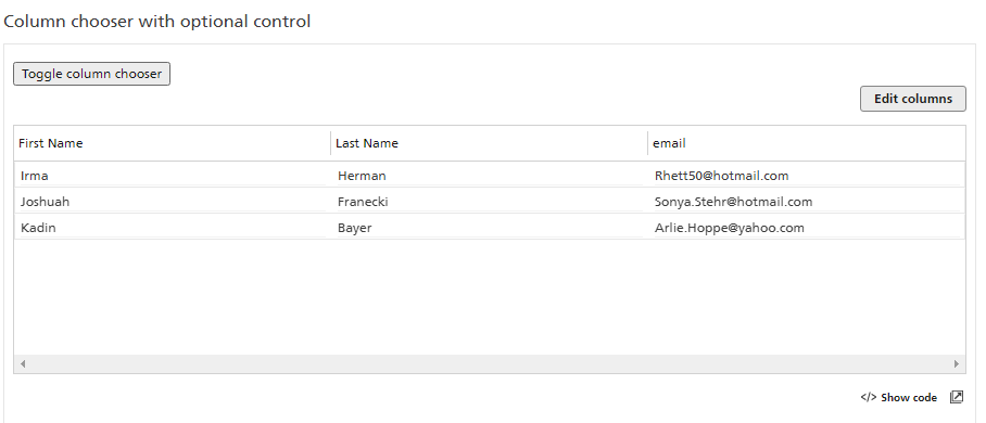
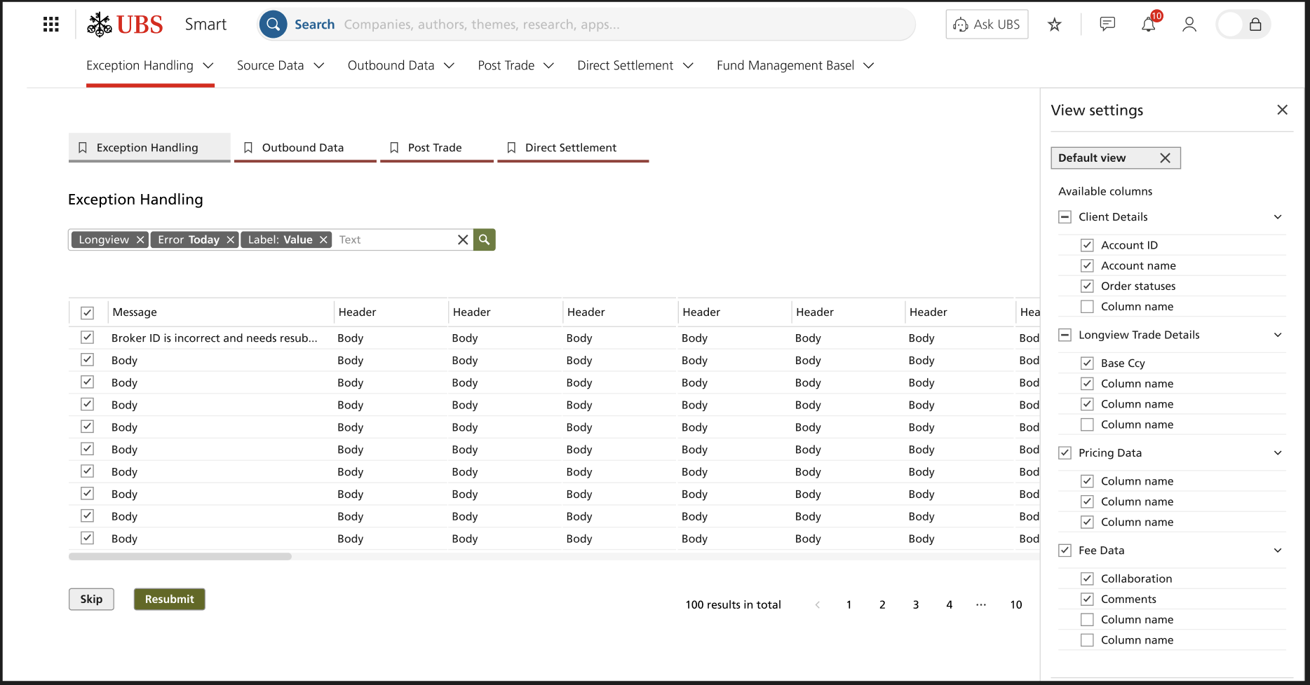
- Tablular Data - Some of the biggest improvement could be within the data the users use to validate/resubmit data
- Ability to re-order columns, and append data to the left.
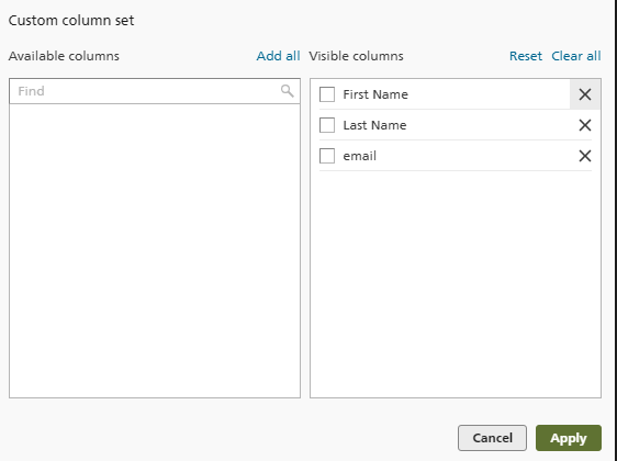
- Ability to edit the columns users can see using the latest React Tables
Filter information can sit directly above the column data, thus being contextual and saving on screen real estate
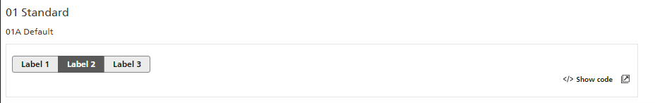
Imager slider gallery below

Initial Conceptual designs
Using the framework identified, the following designs have bene quickly mocked up to show how the platform could look. However there will need to be more research before these are expanded upon and finalized
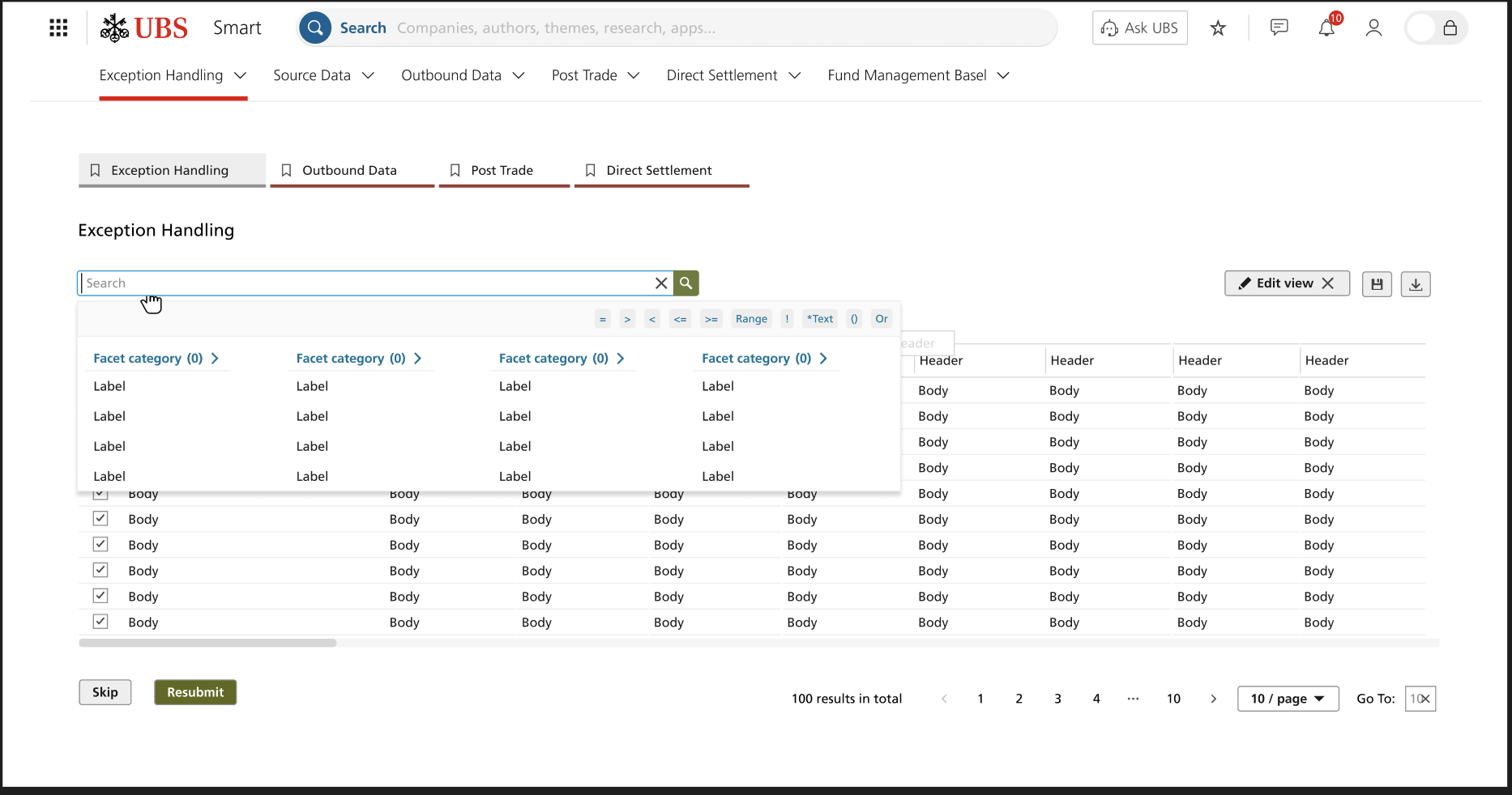
Tablular Data Page
- Ability to filter all the information in one central location, to reduce the screen real estate and decrease cognitive load
- Select all to resubmit trades
- Cleaner look/feel
- Process navigation at the top to progress each trade through the relevant steps needed
Edit Data Settings
- Ability to show/hide relevant columns and data according to each users needs
- Ability to reset
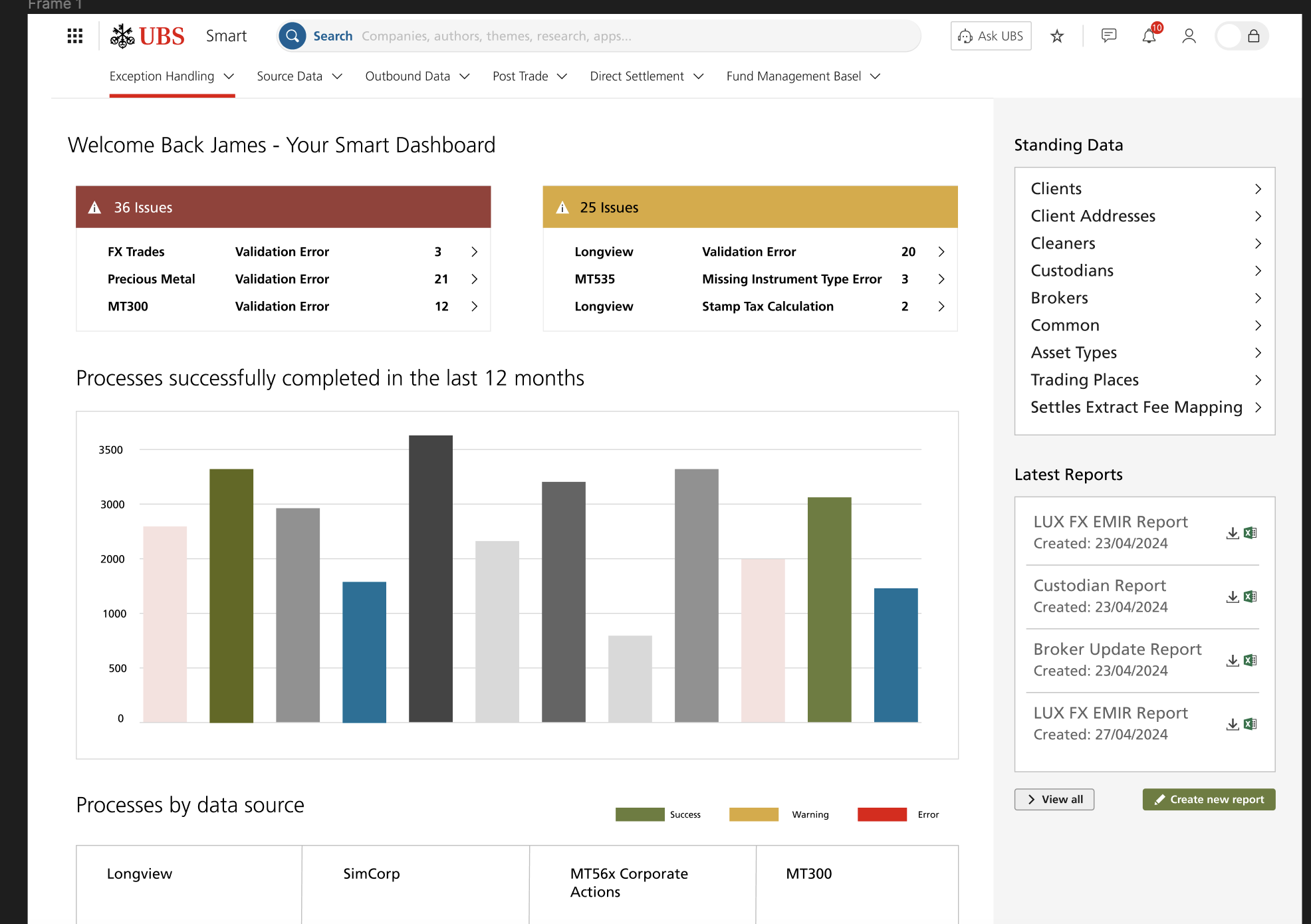
HomePage
Coming up with a different approach for the homepage, using the data available to create a notification/report centre style dashbaord which can be personalised for each different set of user groups, metrics on statts, account openings, broker changes, serious errors etc
Conclusions
The current Smart application is a very 90’s themed application in need of modernization.
The Neo Framework represents a good opportunity to overhaul some of data heavy tables that exist today
Usability including customization of data has to be a key priority
Reduce the amount of repetition that exists within the system today.
Next Steps
- Continue with Draft Ideation of Mockups coming up with different ideas
- Card sorting to work out the Hierarchy of the left hand side navigation
- Further review sessions with PO’s/Users to gain feedback
- Align Business Goals/User Needs